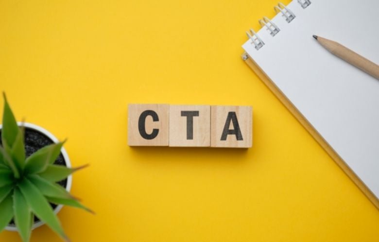
A “call to action” or CTA is a prompt in your email that asks your subscribers to take a next step. That step may be to read a blog article, register for a program, sign up for a newsletter, or donate.
The CTA is usually a button. It can also be linked in your email text to the place where you’d like the reader to take action. “Learn more” or “Register now” are examples of common CTAs.
Review these three steps as you think about the actions you might want your subscribers to take when reading your email:
-
Consider the placement: Is the CTA in a prominent spot in the email? Is there an image or graphic to draw attention? The farther down the reader must scroll to find the CTA, the less likely they are to do so.
-
Use exciting language: “Click here” may be the most common example that we all recognize, but it’s not very exciting or effective. Change up the language when you can. If you’re promoting an event, instead of “Register here” try something like “Sign me up!”
-
Use the right colors: Choose colors that will stand out and draw attention but also look visually pleasing. Of course, you must stay aligned with your library’s branding. Also, consider accessibility. Backgrounds and text with high contrast are more easily seen by those with impaired vision.
This is an excerpt adapted from the guide “Library Newsletters: Best Practices.”

Molly Wyand is a Communications Specialist for NoveList. She is currently reading Creative Confidence by Tom Kelley and David Kelley.