Humans, by nature, are visual creatures. Studies have shown that humans process visuals 60,000 times faster than text. In fact, research conducted by MIT verified that we can process an entire image in as few as 13 seconds. It is more than safe to assume that graphics increase comprehension and retention. In this age of big data, it is difficult for any library to assess complex information and even more so, if analytics tools lack enhanced data visualization. The need for visual library data is critical for library staff to achieve objectives and demonstrate their value to the larger academic community.
What makes visual library data so unique?
1. It Helps to Simplify Data Interpretation
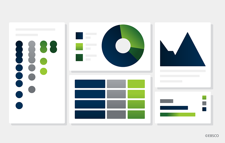
Academic library data reflects various systems data, a large breadth of content and a diverse collection of electronic resources –– not to mention user information –– all of which are valuable in making evidence-based decisions. The amount of data needed to yield some sort of conclusion can be overwhelming. According to an article from ALA’s Reference and Users Services Association, proper library data visualization, “approaches the challenges of size and complexity by fusing the art of design with the logic of statistics.” Traditional library visualization applications such as bar graphs and pie charts have value, but leveraging additional visuals such as word clouds, or scatter plots not only simplifies the interpretation of library data, but creates a story with data.
Proper library data visualization, ‘approaches the challenges of size and complexity by fusing the art of design with the logic of statistics.’
Proper library data visualization, ‘approaches the challenges of size and complexity by fusing the art of design with the logic of statistics.’
2. It Takes the Hard Work out of Presentations
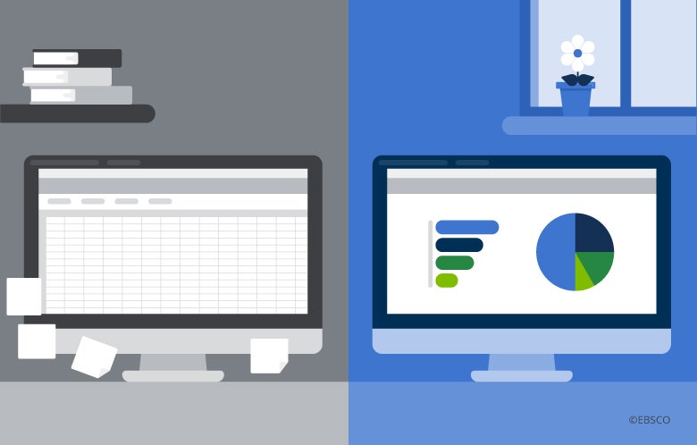
Budgetary requests, vendor meetings and building relationships with faculty can all become easier when the right library data is leveraged. Visual library data enhances conversations with any cohort because it showcases data in a digestible and appealing way. Library analytics tools allow you to download data in a variety of formats to deliver the data in a format that is easy to visually digest (think PDF vs. Excel vs. image).
3. It Connects Disparate Data
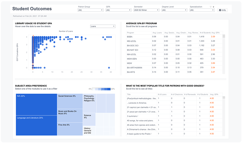
When thinking about your library’s collections or user behavior, your team may have separate spreadsheets or disparate platforms that need to be accessed before manually combining data to establish analysis. The beauty of visual library data (and a tool that can streamline access to various data points) is that it can combine varying data sources and dive deep into areas such as usage or engagement. For example, connecting print book circulation with EzProxy sessions for online resource usage correlates the measure of library user engagement metrics to another measure of Student Success (GPA) and showcases a relationship worth sharing. Connecting data can help showcase that students who use the library tend to have a higher GPA.
4. It Uncovers Trends
Making the invisible, visible, is a significant component of visual library data. By simplifying the presentation of library data and presenting it in a graphical way that is easier to digest allows library staff to relax into an investigative mindset rather than a perfunctory mindset. It allows for questions to arise and unique trends to be uncovered.
The dashboard elements in Panorama™ are all designed with an eye towards giving librarians actionable data when they need it. Librarians can easily see important library data and outliers show up very clearly, allowing librarians to act on issues promptly. Watch the video to learn more about the power of Panorama’s visualization.